2026’s Color-of-the-Year Drama: Why “Cloud Dancer” Isn’t the Whole Story And What to Use Instead
Cloud Dancer: A Clean Slate or a Missed Opportunity?
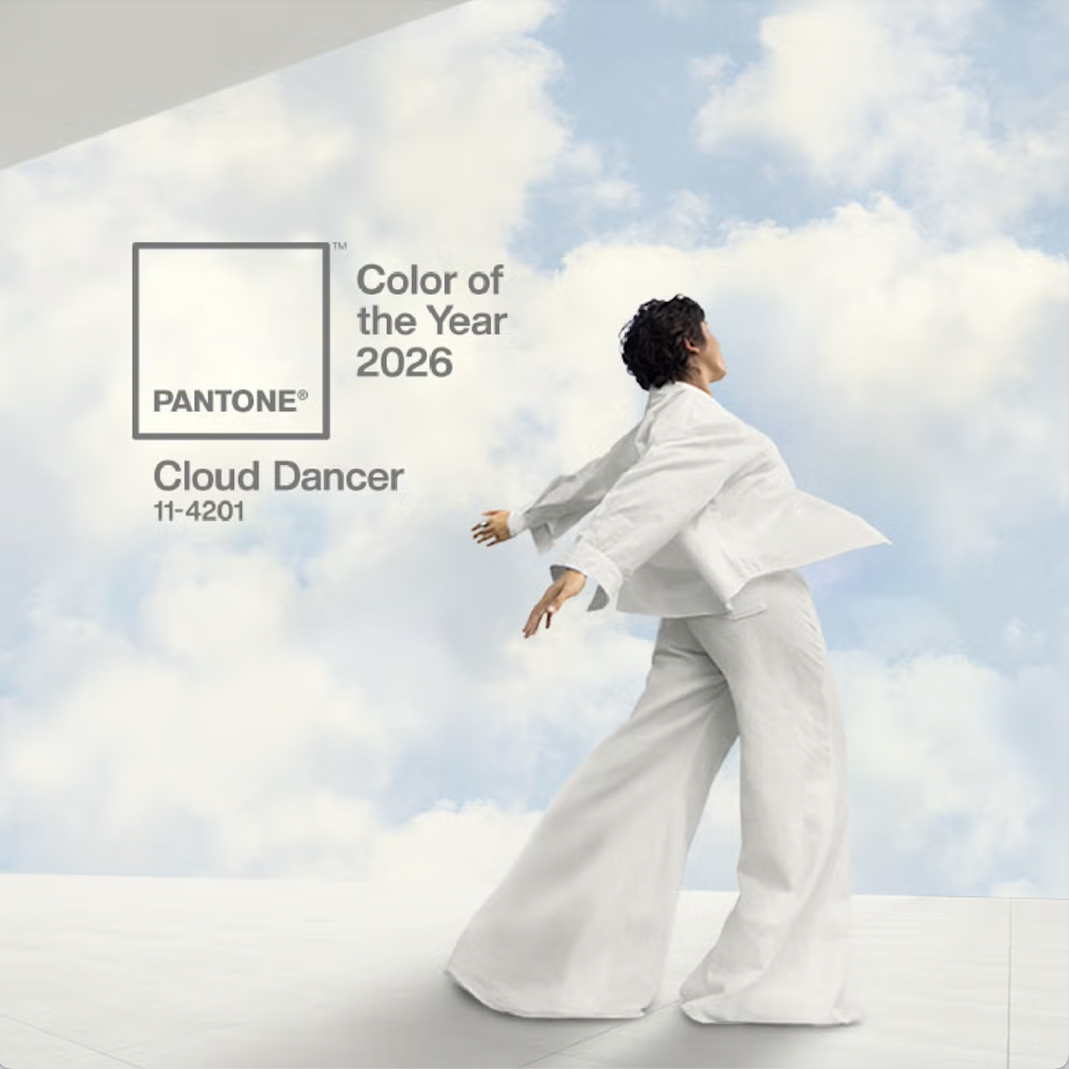
Every year the Pantone Color Institute’s “Color of the Year” announcement stirs buzz in decor and design circles. For 2026, their pick is Cloud Dancer — a soft, airy white (PANTONE 11-4201) meant to signal calm, clarity, and a fresh reset in a chaotic world.
On paper, Cloud Dancer promises serenity, a blank canvas for renewed creativity, minimalism, and space to breathe. But as soon as the announcement dropped, critics and designers questioned whether a neutral white truly captures the spirit of what many of us are craving right now. Some have called the choice “tone-deaf,” arguing that we’re moving away from safe, sterile minimalism, not toward it.
The truth is, while white has its place, a broader, richer palette of colors and textures is emerging for 2026, one that speaks to warmth, authenticity, and spaces that feel lived-in rather than sanitized. In this post, I’m taking a look under the surface: comparing the Pantone message with what home-decor trends are really doing, and showing you how to use those ideas in your own home - with style, depth, and soul.
What Pantone’s Cloud Dancer Represents (and Its Limits)
According to Pantone, Cloud Dancer is more than just a neutral — it’s a “billowy, balanced white” meant to reflect calm, clarity, and a cultural desire to reset. It’s a color that works across styles, and offers a clean slate.
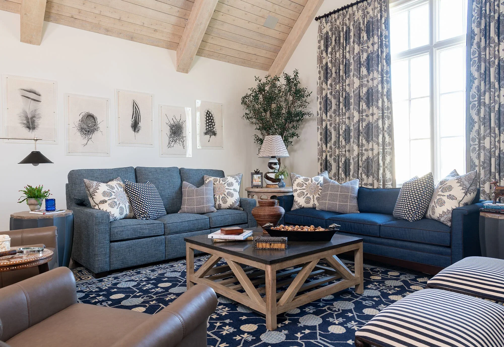
Many designers see Cloud Dancer’s potential: as a serene base for airy bedrooms, light-filled living spaces, or rooms where texture and material — not color — take center stage. When paired with wood, stone, natural fiber, or soft fabrics, this white can feel calm and spa-like instead of clinical.
Still, the pushback is loud; some say choosing white for 2026 feels uninspired, safe, even culturally tone-deaf given the social context. Critics argue that white feels like an erasure of identity or emotion, not a celebration of it.
And from a purely design-trend standpoint, many homeowners and decorators are gravitating toward color and texture in ways that don’t align with white-out minimalism. Which brings us to what’s actually trending.
What’s Actually Trending Now — Real Color, Real Texture, Real Soul
While Pantone goes for clean simplicity, other corners of the home-decor world are embracing warmth, character, and depth. Below are some of the notable emerging directions:
Subtle, Emotive Color & Texture Picks
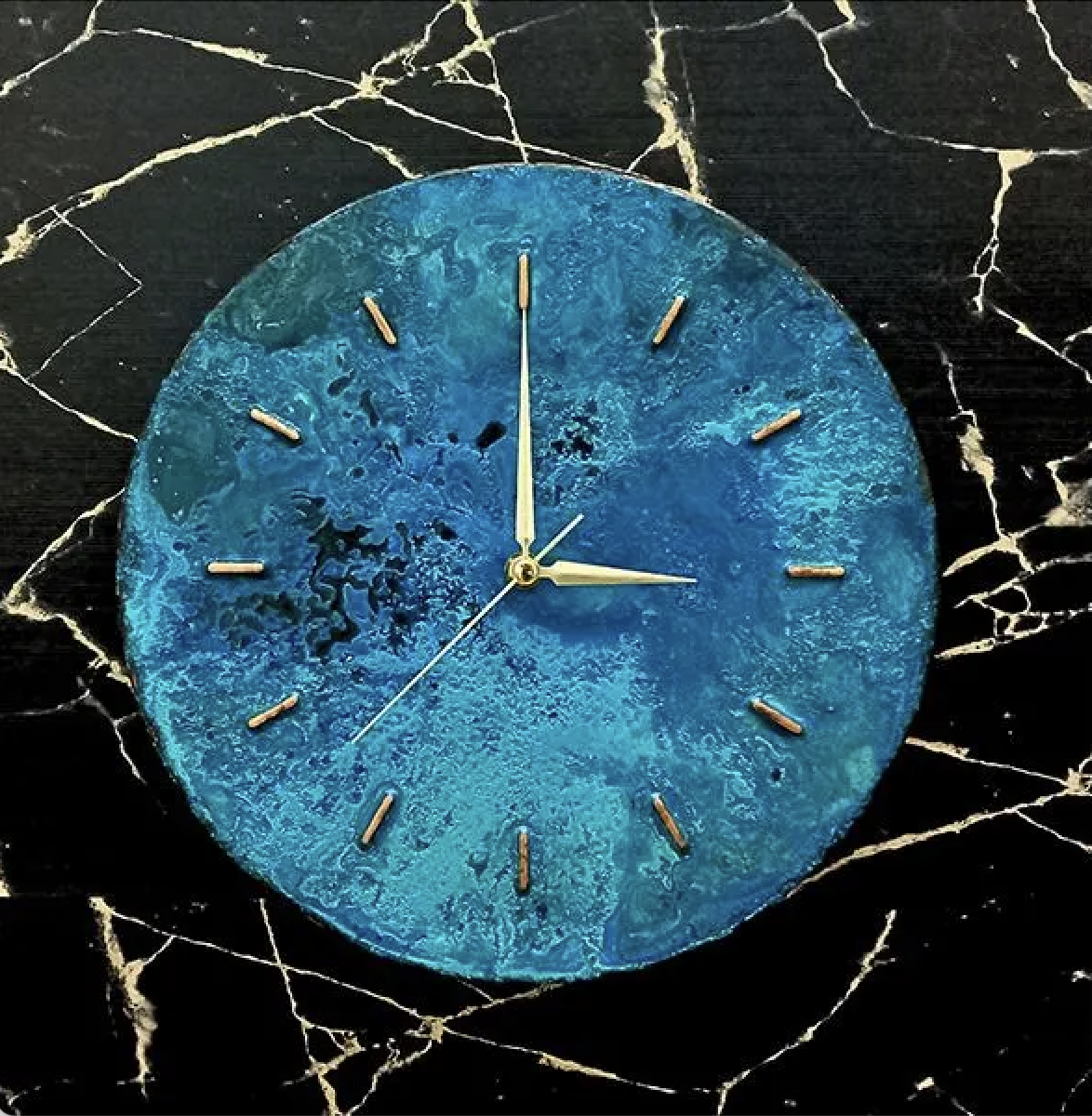
The online marketplace Etsy recently announced its 2026 Color of the Year: Patina Blue — a softly saturated blue-green inspired by aged copper and natural weathering. It evokes softness, vintage character, and nuanced mood rather than bold monochrome minimalism.
At the same time, Etsy’s 2026 “Texture of the Year” is Washed Linen — a relaxed, tactile fabric feel that’s ripe for curtains, pillows, upholstery, or bedding. In decor, it adds depth, softness, and a sense of lived-in comfort.
This shift, toward nuanced color and texture, reflects a growing design sensibility: homes that feel personal, cozy, layered, and timeless, not sterile or showroom-perfect.
Earthy & Authentic Palettes Over Sterile Neutrals
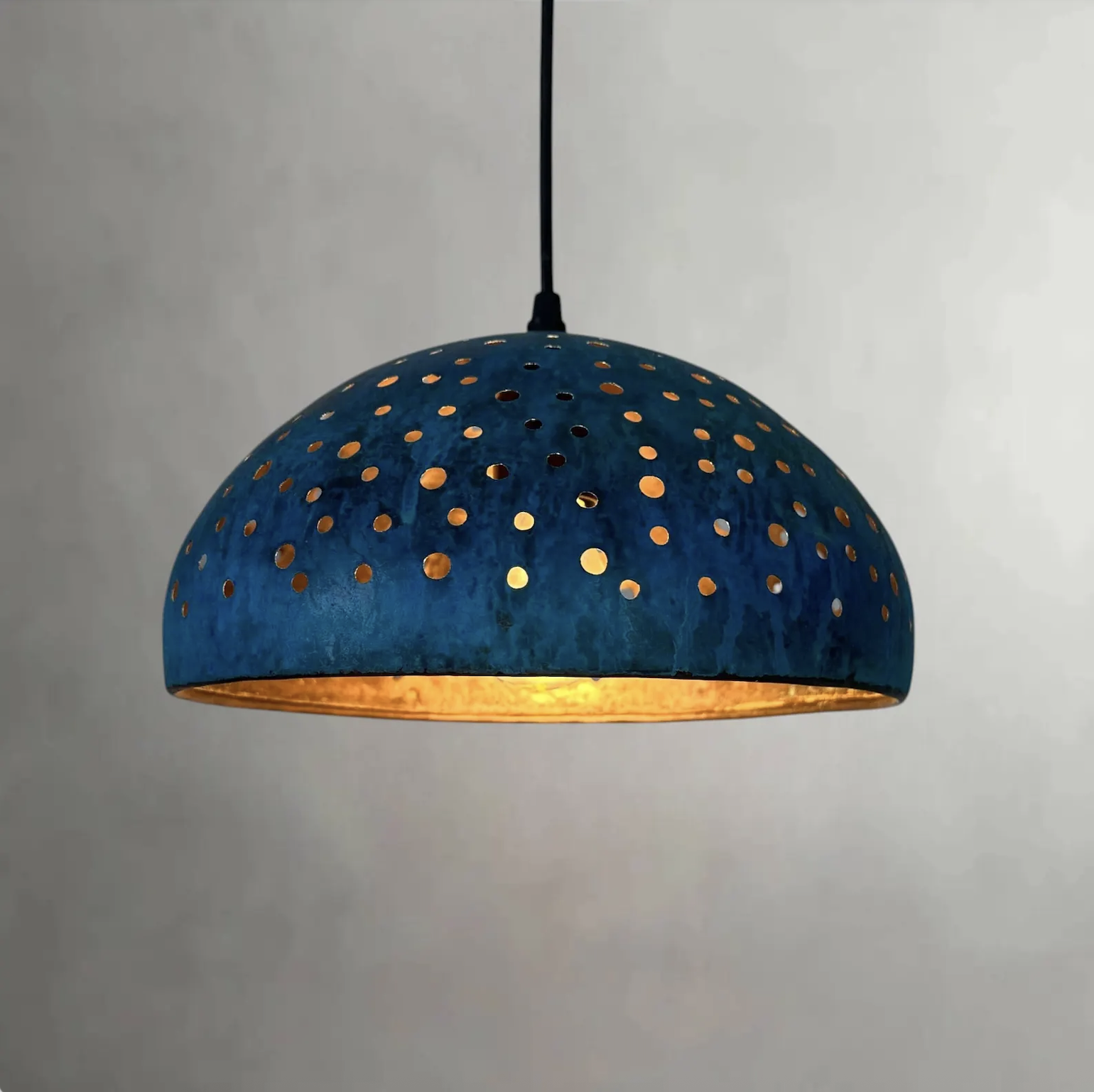
Across design blogs and forecasters, there’s a turn toward “earthy vibrancy”: think clay, muted olives, dusty plums, deep teal-blues, warm wood tones, matte metals - colors that ground a space emotionally and visually, rather than strip it bare. (Even though Pantone went white, these hues are rising in popularity among decorators.)
The appeal is easy to understand: such tones age well, hide wear gracefully, and lend character and soul to a space. In contrast, white walls and furniture can feel like a blank page; calming for some, lifeless for others.
Texture, Material & Layering — What Makes a Home Feel “Home”
The renewed focus isn’t just on color, it’s on material, texture, and layering: linen curtains, woven baskets, warm wood furniture, matte metals, patina finishes, vintage-inspired décor. These tactile choices create depth and warmth that stark minimalism often lacks.
Rather than chasing “perfect” symmetry or a magazine-ready aesthetic, homeowners are gravitating toward spaces that feel real, worn-in, and easy to live in, where comfort, character, and practicality coexist with style.
What This Means for Your 2026–2027 Decor Refresh
If you’re thinking of redoing a room (or a whole home) this year, here’s how to use these insights to create a space that feels current, layered, and authentic:
Use white (Cloud Dancer) as a starting point but don’t stop there. If you love light, clean spaces, paint walls or trim in Cloud Dancer. But anchor the room with warm textiles, wood furniture, and metal or ceramic accents so it feels grounded.
Add color with intention. Try an accent wall, throw pillows, rugs, or décor in saturated yet soft hues like Patina Blue, muted olive, dusty plum, or deep teal, or warm neutrals like clay or terracotta.
Layer textures. Combine washed linen curtains, woven baskets or rugs, raw or stained wood, matte metals, terracotta; let materials speak louder than perfectly matched paint colors.
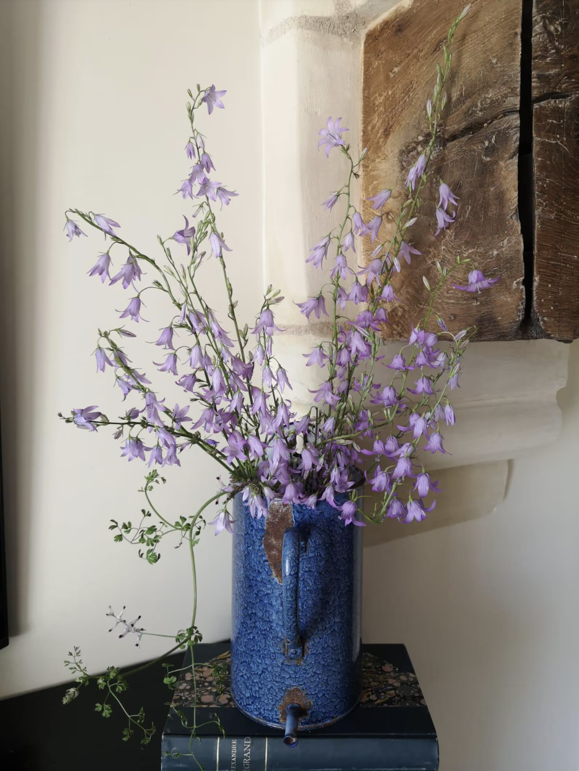
Blend vintage and new. A well-worn patina vase, an antique side table, or secondhand wood furniture can bring soul to a modern home, making the space feel collected rather than curated.
Prioritize comfort & longevity over trend-chasing. Choose materials and colors that age well, hide wear gracefully, and make everyday life simpler and more beautiful.
Shop the 2026 Mood — Decorating Picks to Get the Look
Paint & Swatches in Cloud Dancer-White: For walls or trim — creates a light, airy base; ideal “blank canvas.”
Accent in Blues, Greens, Earthy Tones (Patina Blue, Olive, Clay, Teal): For accent walls, built-ins, or statement furniture brings soft color depth without overpowering.
Washed Linen Curtains / Pillow Covers / Blankets: Adds softness, warmth, and texture to balance a white or neutral base.
Natural-Wood Furniture / Woven Baskets / Matte Metal Decor: Introduces natural tones and material depth, keeps space grounded and homey.
Vintage or Patina-Finish Decorative Items (Vases, Lamps, Trays): Creates layered, collected feel, adds character that evolves over time.
Cozy Textiles (Throws, Rugs, Natural Fiber Cushions): Softens minimalism, invites comfort and everyday living rather than perfection. Splurge Spend Rug
Start with a soft white base, then build warmth, character, and depth, and watch your home feel like a cozy, timeless sanctuary rather than a minimalist showroom.
This post contains affiliate links. If you purchase through the link above, I may earn a small commission at no additional cost to you.